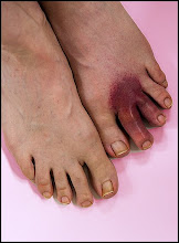
Comic-Book Colors
I wouldn't want you of all people to think that my fondness for glaring flat colors is just a symptom of twisted color faculties. When I took up, or rather re-took-up, photography in '98 (not even six years ago, just fancy that), I did my thing in the woods mostly. Figured I would retreat from a hostile world into the more frankly hostile wilderness. But it didn't work out that way. I got the idea of doing nature photography as though it was studio fashion photography, partly as a reaction against the stupid websites that wouldn't publish any photo which showed "the hand of man." I began to move in a direction I've long associated with old age, the direction of artifice. (When he was my age, Yeats wrote about this in "Sailing to Byzantium," where he says he wants to be no natural thing but rather like a bird of hammered gold and clockwork that sings to the lords and ladies of Byzantium.) I want to make it clear that my photos are not imitations of natural objects but natural objects in their own right, with their own color and logic. Too good to be true, natural only in the sense we hear at funerals: "He looks so natural!"
So however "realistic" my stuff is – and I try to make it super-real, realer than real, surreal, by keeping images sharp and well defined – it looks somehow fake-o, studi-o. This is Intentional. Death is more perfect than life. I do lots of still lifes in the French spirit – French for "still life" being, of course, "dead nature" – nature morte.
Whereas mit der Viertel, even your raunchiest most distorted images are full of life and the approximations and collisions and irritability that define life almost. Like your sculpture – doesn't look quite like a bod, but has earth in the mouth and dirt under the nails and is in all ways organic and a living thing. My stuff being purposely cold, sterile, unfeeling, distant, dramatic. Yours being lyrical, with no obvious separation of the artist from the art. Mine minus the artist, who's presumably bored and sanding his nails in the wings. Yours supercharged with your own blood, sweat and tears. The blood in mine being merely a decorative element.
You dig.


1 Comments:
this post would make more sense if i could see the photo that is inquestion with the "flat colors" - adam | www.totallygreat.com
Post a Comment
Links to this post:
Create a Link
<< Home